All 32 Reverse Retro’s Ranked
In case you ‘re unaware, due to living under a rock, for the past two season’s every NHL team has put out a “Reverse Retro” jersey. The concept is to do a reimagining of a classic jersey, meaning an old-school logo with the colors changed into something new. It doesn’t matter how much I know that this is a cash grab, I am a sucker for new jerseys, and after looking at them all this is my complete ranking, from best to worst.
I’ve also included where ESPN ranked the jerseys in their list in parenthesis.
1- Florida Panthers (1)

“Perfect, down to every last detail.” I’m very very happy with these. It’s unfortunate that the Panthers are the Maple Leaf’s of the south, and won’t do anything in the playoffs, because these jerseys deserve a storied run. Also, the only ranking that ESPN and I agree on.
2- Colorado Avalanche (5)

Based off the original Colorado Rockies and these are IMMACULATE. The logo is better than the original, and the colors are perfect. I truly think that an argument can be made that these are the best in the league but am happy placing them here. The more you look at them the better they get, go check out the Av’s Instagram for even more pics and do your best not to add them to your shopping cart. Even non-hockey fans have to love these things, and I can’t wait to see them on the ice.
3- Washington Capitals (13)

Is #3 too high for the screaming eagle? Hell no. It’s the best jersey the Cap’s ever rocked, and was when Ovi was at the height of his powers. Bringing it back while the Russian Machine chases Gretzky’s goal record is brilliant.
P.s. I had an Ovi poster wearing the original version of this jersey on my wall as a kid. If you don’t want bias in your list, write your own list. But this one is mine.
4- Vancouver Canucks (12)

Green jersey’s can be hard to pull off, just ask the Dallas Stars. That’s why they do black or all-white so they can look like storm troopers every year. But these are done very well, and it’s just something I want to see on the ice.
5- New York Islanders (11)

”GIVE US THE FISHERMAN!’ -cried the fans
“I will and it’ll be awesome” -whispered Lou
These are the 90’s acid trip jersey’s that everyone has always wanted, and seeing them again doesn’t make me want it any less. Great colorway, even better logo.
6- San Jose Sharks (2)

Another Jersey that has *almost* nothing to hate about it. The colors are fantastic as the Sharks recreate the iconic California Golden Seals. In fact, the jersey is almost the exact same as the Golden seals, it just says “Sharks” instead. I think it’s how lazy they were in making the jersey different that makes me like it less, but still an awesome jersey.
7- New York Rangers (16)

What can I say, I’m a sucker for old logos. Just like the Islanders the Rangers went with an awesome 90’s logo and I’m just always going to be a fan. I’d like it more if they didn’t do it last year…and if last year’s jersey wasn’t better.
8- Pittsburgh Penguins (17)

90’s logo, sleek design, what else can I say. Play the hits and I’m going to like your jersey a lot, and Robo Penguin is certainly a hit. I wish they spiced it up a little more. Maybe made the main color the baby blue, think that could be exciting, but otherwise it’s a great jersey.
9- Arizona Coyotes (8)

It’s a reverse retro…of last years reverse retro. Can’t say that they invoke memories of a by-gone era, or that they have a legendary history behind them. But I also can’t say that I don’t like these. Even if they were designed by a guy who’s way to into Deadpool, and may or may not be trying to break the 4th wall with these meta jerseys, these are good. Unlike the Pens reminding you of Mario Lemieux, these remind you of nobody. Shocking for a franchise that has had Pavel Datsyuk, Marian Hossa, and Paul miss-the-net.
10- Anaheim Ducks (15)

We are firmly in “meh” territory now and that’s kinda all I have to say about these. They don’t own the rights to the real Mighty Ducks (property of Disney) So they used orange and are trying to make you forget that they look better with jade and eggplant. I’d like it if it said Zegras on the back though.
11- Edmonton Oilers (10)

Again… meh. I’m not excited or impressed, but I’m not too disappointed either. They are a lot like the Oilers season last year.
12- Winnipeg Jets (19)

Let’s rapid fire some of these. Jets…meh
13- Dallas Stars (18)

Meh
14- Carolina Hurricanes (26)

Very Meh
15- Ottawa Senators (27)

Less meh and more of a wait and see pick. Adidas promises a “Head-to-toe” black look to go with these, so they might be awesome on the ice. But If you are picking one of these up, just do yourself a favor and get an old Alfredsson jersey and remember when your team was good.
16- Seattle Kraken (24)

This is a tough assignment for a team that’s going into their second year of existence. I’m going to give them a pass and put them toward the bottom of my “meh” jerseys, but I really don’t care for these. This whole thing is a cash grab, but these feel especially flagrant to that, and very boring. I would have preferred they did something wacky, or just released a normal third jersey. The kraken colors are cool, but I didn’t want them to just “add more stripes”, and that feels like what they did here.
17- Buffalo Sabers (23)

We are coming out of “meh” and more into bad jersey’s now, but I’m not ready to call these bad…Yet. I like the white, and really liked these when I first saw them. Unfortunately I accidentally looked at them too much, and they have turned into a bit of a pumpkin fast. The buffalo started to look like a goat, and I wish they did the black and silver instead…it just isn’t good.
18- Los Angeles Kings (4)

They are good, just not great. The colors work well together, and it’s a classic mix of the purple and gold, but the crown has too much going on for me. The rest of the jersey is sleek and simple, so having a chaotic smattering of colors on that crest just feels like there is too much happening.
19- Montreal Canadians (3)

This was better last year. I do like the way the crest stands out against the blue, but it’s a lot of blue. Like, nothing but blue, and it’s not fun at all. What if Montreal just said, “fuck it, use black on the outside and the light blue in the center.” I think I would have liked that.
20- Calgary Flames (30)

It could have been really good...but it isn’t. Trying to bring back the ribbon was bold, and I have to give points for that, and black with red and yellow does look cool. At the end of the day, the ribbon looks like a mistake and I’d feel like an idiot for wearing this. To pile on, this means we won’t get a black jersey until at least 2024-25, and I think that’s bogus.
21- Las Vegas Golden Knights (6)

This jersey is going to split people, like crossbody letter jersey’s always do. Colorado has one of the best of all time, then they tried it in blue and even I hated it. But that’s not the problem for me. What I hate is that they are modeled after a defunct team, that never had anything to do with the Knights. This is a team that has made it clear they don’t care about history, but they want to pretend they existed in ’95. I don’t mind the jersey, the colors look nice, but I hate the team and ownership group that pretends they actually care about honoring the past.
And fuck you for how you treated Flower, that man is a gift to us all. (Again, make your own list if you don’t like how I feel)
22-Columbus Blue Jackets (28)

Use whatever words you want. Tame, boring, forgettable, these jersey’s fit the state of Ohio. It’s not a fun place, but the crime rate is better than St. Louis. Speaking of…
23- St. Louis Blues (7)

These suck, just like your town. At first glance you think, “Oh, not bad!” Then you get a little closer and you notice it looks cluttered and too spread out at the same time, and it is just too much yellow. Just like when you see the arch then look around and see…nothing else but SO much crime. It’s too much yellow, they are going to look like moving pee stains on the ice. I hate it.
24- Minnesota Wild (21)

Oh look, the Minnesota Wild presented by Subway sandwiches made a green version of last years jersey.
25- Boston Bruins (9)

This jersey is another that suffers from having a bad crest. But this crest feels more flagrant than LA, and I can’t get past it. I love the way the jagged lines work with the pipping on this jersey. The brown and yellow work perfect with the white, and the numbers look awesome. That bear just looks so dumb. If pooh bear lived in a crack house, that’s what he would look like. Just to add insult to injury, the Bruins have logos that would work really well with this jersey, and it feels unfair that they robbed us of that.
26- Nashville Predators (25)

Again, moving piss stains on the ice, and I know that’s not new for the Preds, but it doesn’t help. This is also just their regular home jersey with a different, worse logo. Seriously, go look these up for yourself so you can zoom in on the cat. He looks like he doesn’t even want to be there.
Yes, they followed the formula (kind of). It’s an old-school logo, but the jersey itself is the same as almost every other one. It’s not fun, and a black one probably would have been.
27- Philadelphia Flyers (31)

They did what Detroit did last year and just made their practice jersey. It’s boring and monochromatic, but I think that describes like almost every single Flyers jersey…also the city of Philadelphia.
28- New Jersey Devils (20)

They are much better than last year when Marty Brodeur decided to jerk himself off with the “jersey” jersey. I can’t get into enough detail on why those sucked, but they are easy to find, and you can hate them yourself. The problem with these is just timing, and the fact they feel stolen. Yes, the original Colorado Rockies moved to the Jersey Shore, and that’s where this franchise roots are. But there is a new team in Colorado, and they are better…and so is their jersey.
Everything that makes Colorado’s jersey look sleek and new doesn’t exist here. The colors look blocky, and it reminds me of a rug you’d see at a preschool. They remind me of the Colorado Jersey with their colors, and it’s a shame, because I’d rather just go look at those.
29- Tampa Bay Lightning (32)
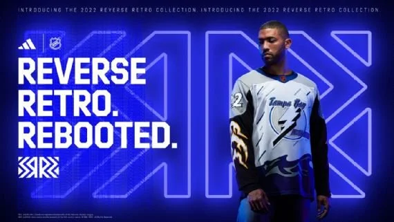
Hate it, obviously. There is just a ton going on, and almost none of it works. The logo is good, then almost nothing else works. I’ll give them credit for just going nuts with it though, because the bottom three did nothing.
30- Toronto Maple Leafs (29)

I didn’t plan to put three of the Original 6 in the last three spaces, but it doesn’t look like any of them even tried on these. If you saw a random picture of these, you wouldn’t even notice that they were new. They look like every other jersey Toronto has done. I would have loved a St. Pats jersey, or just anything but the blue and white jersey with essential the same crest they’ve used for 100 years.
Just to make things worse, they are supposed to be honoring the 1962 Stanley Cup team. Feels like they weren’t satisfied not caring about the jersey but decided to troll their own fans at the same time. I hope they wear them in the playoffs against Boston though.
31- Chicago Blackhawks (22)
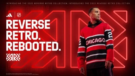
These last two are essentially the same, and it sucks. But, this one can go second to last because at least nobody is watching the hawks this year. It looks like the cut the center of the jersey out and just stitched on the tube tops in the fan store. Kind of makes you wonder how a team was able to make black and red look boring.
32- Detroit Red Wings (14)

It’s the same jersey as Chicago with less white. It’s like when you let your buddy copy your homework as long as he changes a few answers. But, to make things worse, they have SO many good designs they could have chosen from.
I agree with getting away from using the flying wheel, that logo is perfect how it is, and there is no reason to ruin that. But they could have done SOMETHING new, and again…original 6, so many options. Feels like the real loser is the fans. Especially when the team is showing a lot of promise after some down years. I’m not mad, just disappointed.